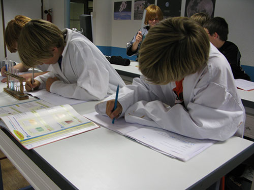
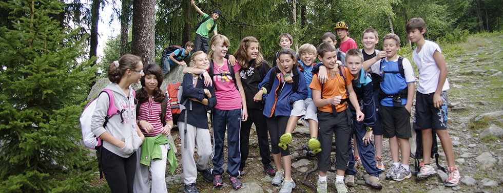
Classe 1
 The basic idea of responsive design is to have a layout that is not bound to a particular screen size, but instead adapts flexibly to different device resolutions. To achieve this the Warp 6.2 framework offers all the tools you need: A fluid grid sytem, fluid images and media, CSS media queries, breakpoints and corresponding JavaScript functions. Learn more in our blog posts about the layout and CSS parts and the JavaScripts parts.
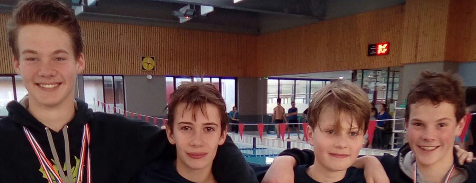
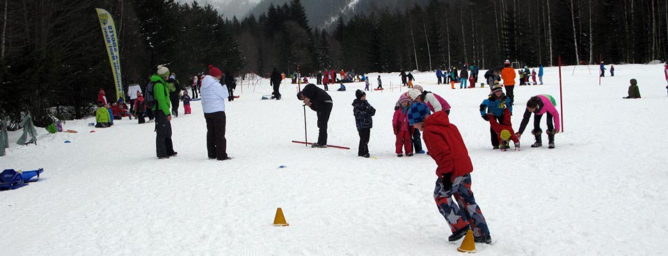
Classe 2
Of course we also updated our famous Master theme. This theme is the perfect blueprint to create responsive themes based on the Warp 6.2 framework. Compared to the Nano2 theme it is completely stripped down, has no styles and includes only the neccessary basics. It is GPL licensed and available as a free download for Joomla and Wordpress.
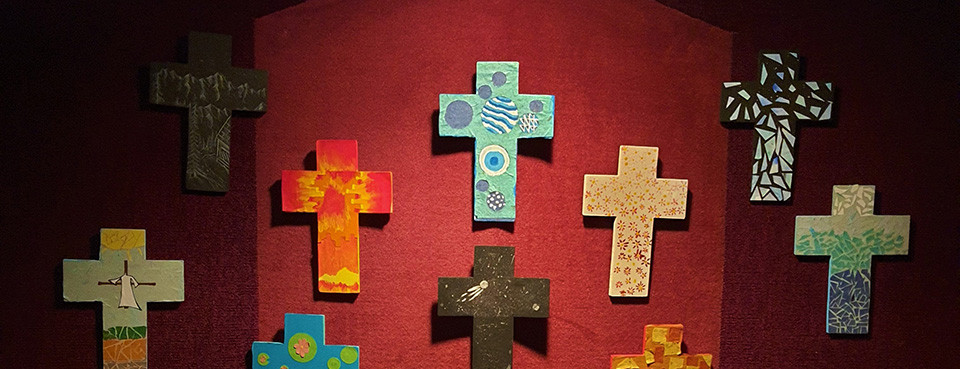
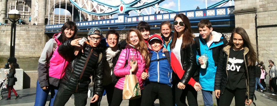
Classe 3
Sous-titre
All older Warp 6 based themes can be updated to Warp 6.2. But they'll still continue to use the mobile theme and not the new responsive features. If you want to make your theme responsive you need to take a look at the Nano2 theme, see how this is accomplished and make your own modifications.
Sous-titre
Some Warp features are deprecated and will not be available in Warp 7 like the Mobile theme, CSS3Pie, IE CSS files and some CSS classes (see changelog). If you update your own themes, remember that in Warp 6.1.11 we've already changed the search to use a CSS class

")
 En classe de 6ème et 5ème :

